The Image Module
How to add, configure and customize the image module.
It is easy to add or edit images anywhere on the page. All images come with 4 different animation styles that make browsing your website fun and engaging. Image modules can be placed in any column that you create, and their size will be adjusted to fit. Be sure the image uploaded is not a large file size though or you will slow the load speed of the website.
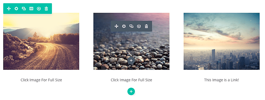
How To Add/Edit an Image Module To Your Page
Once you have entered the Builder, you can click the gray plus button to add a new module to your page. New modules can only be added inside of Rows. If you are starting a new page, don’t forget to add a row to your page first. We have some great tutorials about how to use row and section elements.
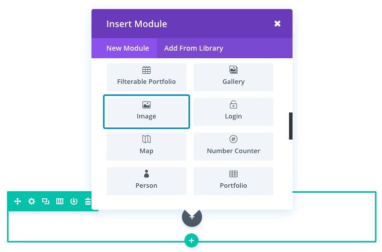
Locate the image module within the list of modules and click it to add it to your page. The module list is searchable, which means you can also type the word “image” and then click enter to automatically find and add the image module! Once the module has been added, you will be greeted with the module’s list of options. These options are separated into three main groups: Content, Design, and Advanced.
Image Content Options
Within the content tab, you will find all of the module’s content elements, such as text, images, and icons. Anything that controls what appears in your module will always be found within this tab.
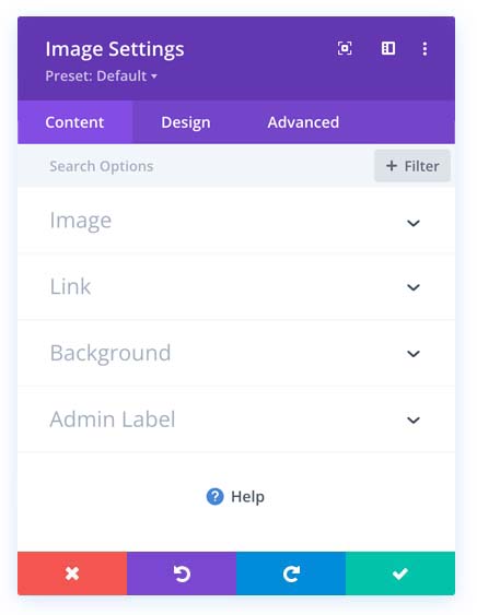
Image
Choose/upload an image via the WordPress Media Library. Images will always appear left-justified within their columns and will span the full width of your column. However, your image will never scale larger than its original upload size. The size of the image is determined by the space win which you are using. Be sure your image is not too large or it will take longer to load and slow the overall load speed of the page.
Open In Lightbox
Here you can choose whether or not your image will open in a lightbox when clicked. If enabled, then your image will “zoom in” to its full size when clicked inside a modal window. This is a great feature for portfolios.
Link URL
Place a valid web URL in this field to turn your Image into a link. Leaving this field blank will simply leave your image as a static element.
URL Opens
Here you can choose whether or not your link opens in a new window.
Admin Label
This will change the label of the module in the builder for easy identification. When using the WireFrame view in the Visual Builder, these labels will appear within the module block in the Builder interface.
Image Design Options
Within the design tab you will find all of the module’s styling options, such as fonts, colors, sizing, and spacing. This is the tab you will use to change how your module looks. Every module has a long list of design settings that you can use to change just about anything.
Design Options
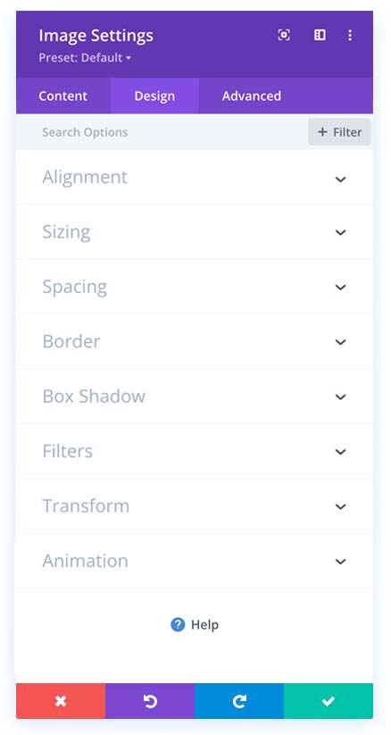
Here you can align your image, adjust the sizing, spacing, add a border, add a box shadow, filter, transform, and animate your image. It is suggested that you keep the settings how they are and simply add your new image.
Advanced Options
We strongly suggest staying clear of this area. Use the advanced options to give your text module custom CSS ID’s and Classes. Add some custom CSS for advanced styling and designate the module’s visibility on certain devices.
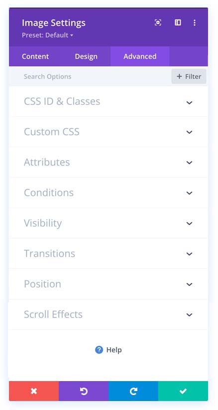
CSS ID
Enter an optional CSS ID to be used for this module. An ID can be used to create custom CSS styling or to create links to particular sections of your page.
CSS Class
Enter optional CSS classes to be used for this module. A CSS class can be used to create custom CSS styling. You can add multiple classes, separated by a space. These classes can be used in your Child Theme or within the Custom CSS that you add to your page or your website using the Theme Options or Builder Page Settings.
Custom CSS
Custom CSS can also be applied to the module and any of the module’s internal elements. Within the Custom CSS section, you will find a text field where you can add custom CSS directly to each element. CSS input into these settings is already wrapped within style tags, so you need only enter CSS rules separated by semicolons.
Attributes
This is where you can enter the image alt text and the title text.
Conditions
Conditions will never be used.
Visibility
This option lets you control which devices your module appears on. You can choose to disable your module on tablets, smartphones, or desktop computers individually. This is useful if you want to use different modules on different devices, or if you want to simplify the mobile design by eliminating certain elements from the page.
Transitions
This option allows you to adjust the transition speeds, this option will hardly ever be used here.
Position
Conditions will never be used.
Scroll Effect
This option will rarely be used here.
